Alaska Airlines Capstone
Medelita.
DURATION
January - June 2019
MY ROLE
UX Research + Design
MEDIUM
Web Design
Overview
Many Alaska Airlines customers currently rely on using the Call Center to make changes to their flight reservation instead of self service tools on the website or their mobile application.
My team of myself and 3 peer designers created a redesigned desktop change experience aimed to empower guests with self-service tools in order to increase their autonomy, while decreasing their frustration and Call Center volume for Alaska Airlines. This project was our Senior Capstone project sponsored by Alaska Airlines.
The Problem
Alaska Airlines came to my team with a problem. Alaska has two different ways for guests to make changes to their reservation after they have completed their booking. Guests can either:
- Make changes themselves online using the Alaska Airlines website
- Call in to the Alaska Airlines Call center and speak to an employee.
Although the tools in place online are highly functional, guests are still calling in to the Call Center at high rates. Alaska Airlines researchers and designers wanted us to figure out why + if we can change this.
Research
Our research question was: How do guests prefer to change their flights and why do they choose these particular methods?
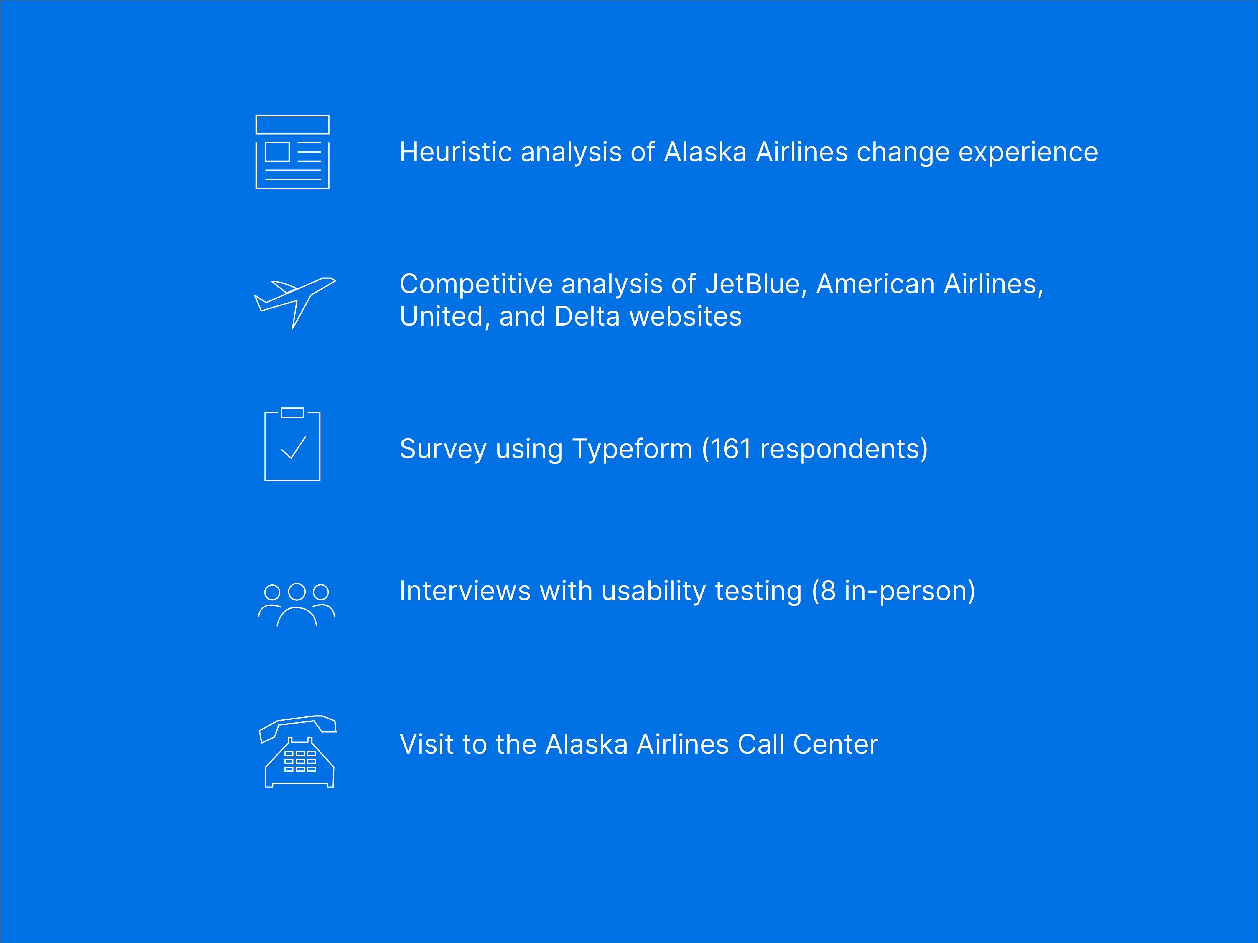
To answer to this question, my team began our project utilizing 5 distinct research methods. I focused on the heuristic analysis, the interviews, and a visit to the Alaska Airlines Call Center. I also did a competitive analysis of the JetBlue change experience.
High Level Results
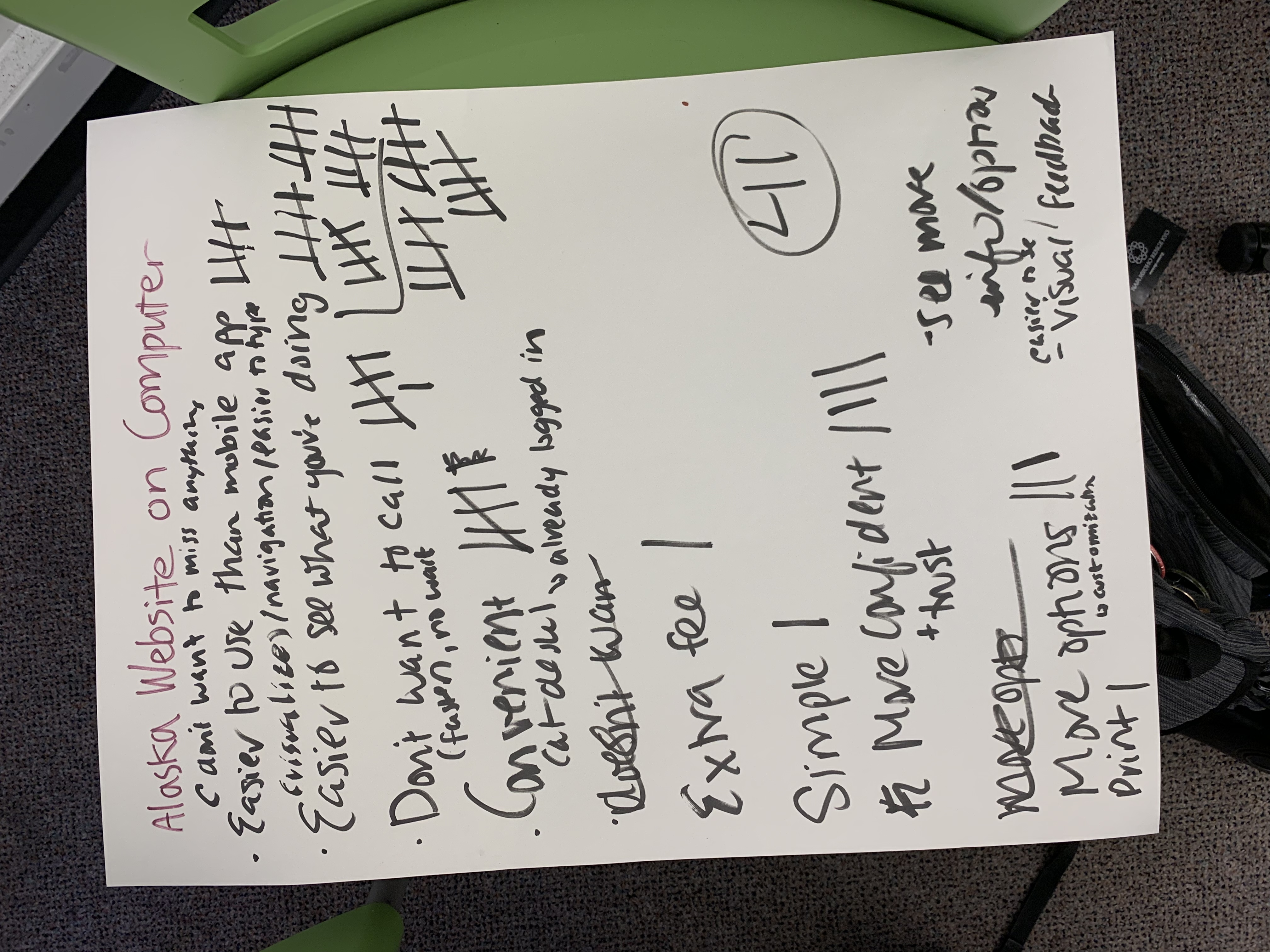
Through our survey, interviews, and Call Center visit, I learned that there is a general lack of confidence in guest’s ability to use the online change system and the accuracy of the information on the system.
Alaska Airlines’ guests call the Call Center when:
- They need to make multiple changes to their reservation
- They believe they can get a better deal
- They want to tell their story (i.e. family emergency)
Ideation
After research, it was time to sift through all of the data we collected to better understand which users we want to increase confidence in and how we can do that.
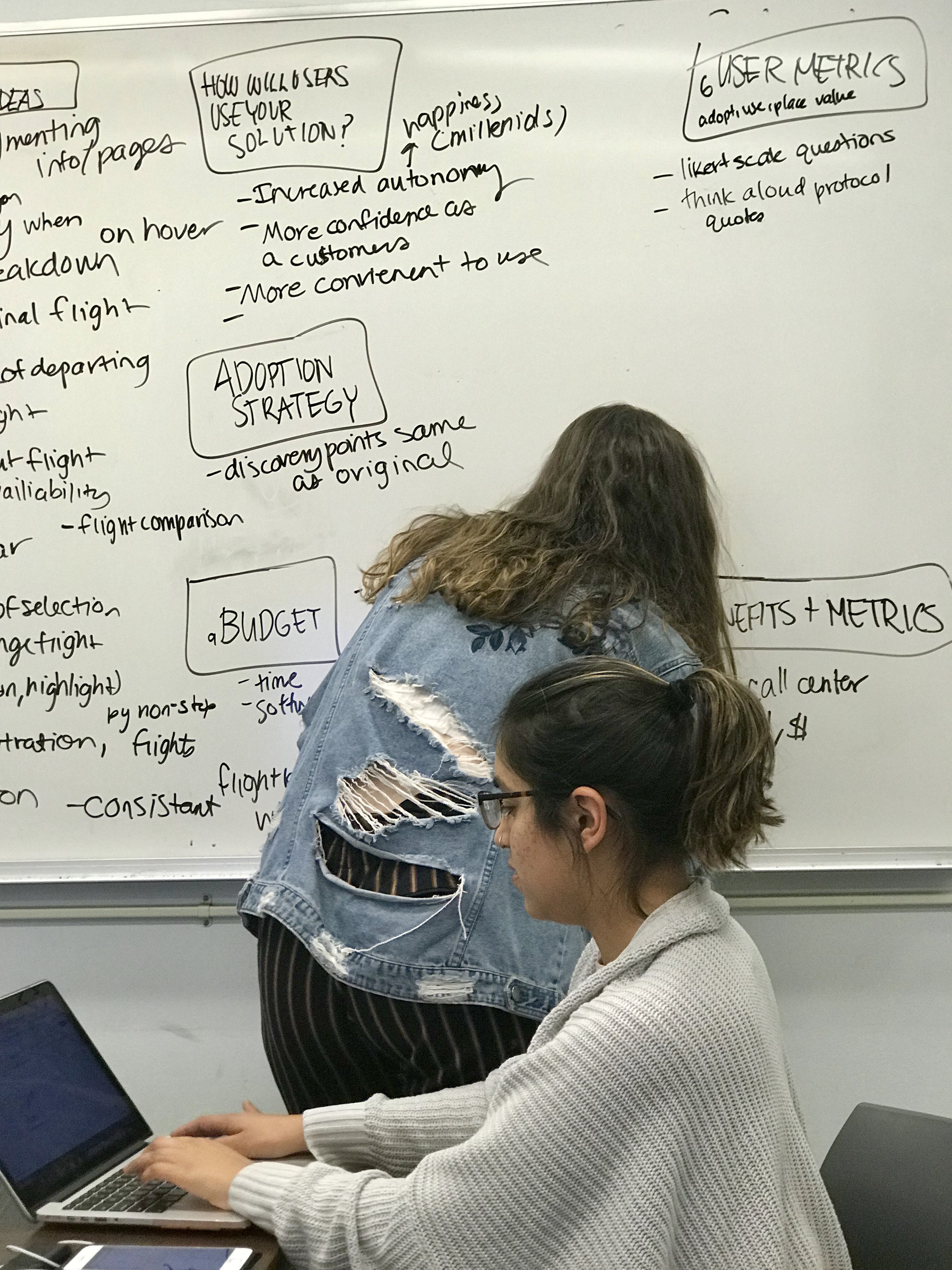
My teammate Aleenah and I utilized an opportunity canvas to get an idea of how our research insights could overlap with design + business goals of Alaska Airlines. We ultimately decided to focus our attention on the average flyer as it is the most common use case.
Personas
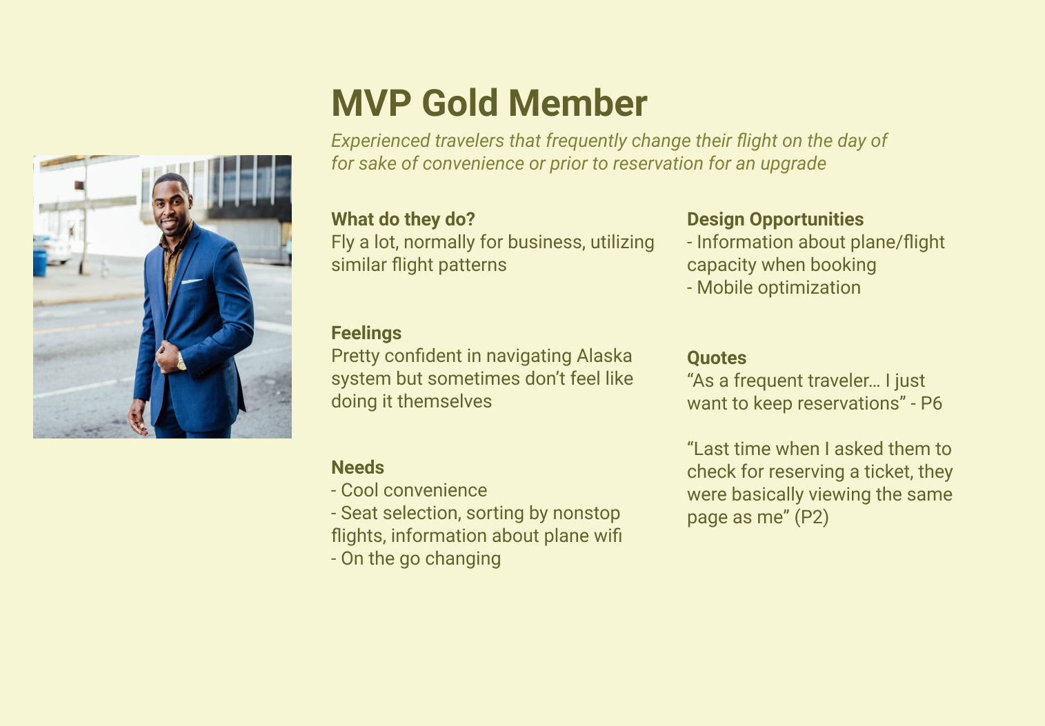
I created four personas to better to tell the stories of common use cases for the products based on demographic data from surveys and interviews. These personas included the average flyer, millennial travelers, bargain hunters, and MVP Gold Members. Here is an example of one persona:
Paper Prototypes
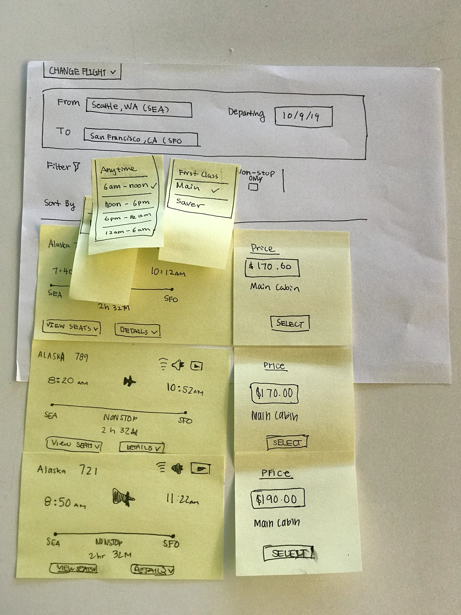
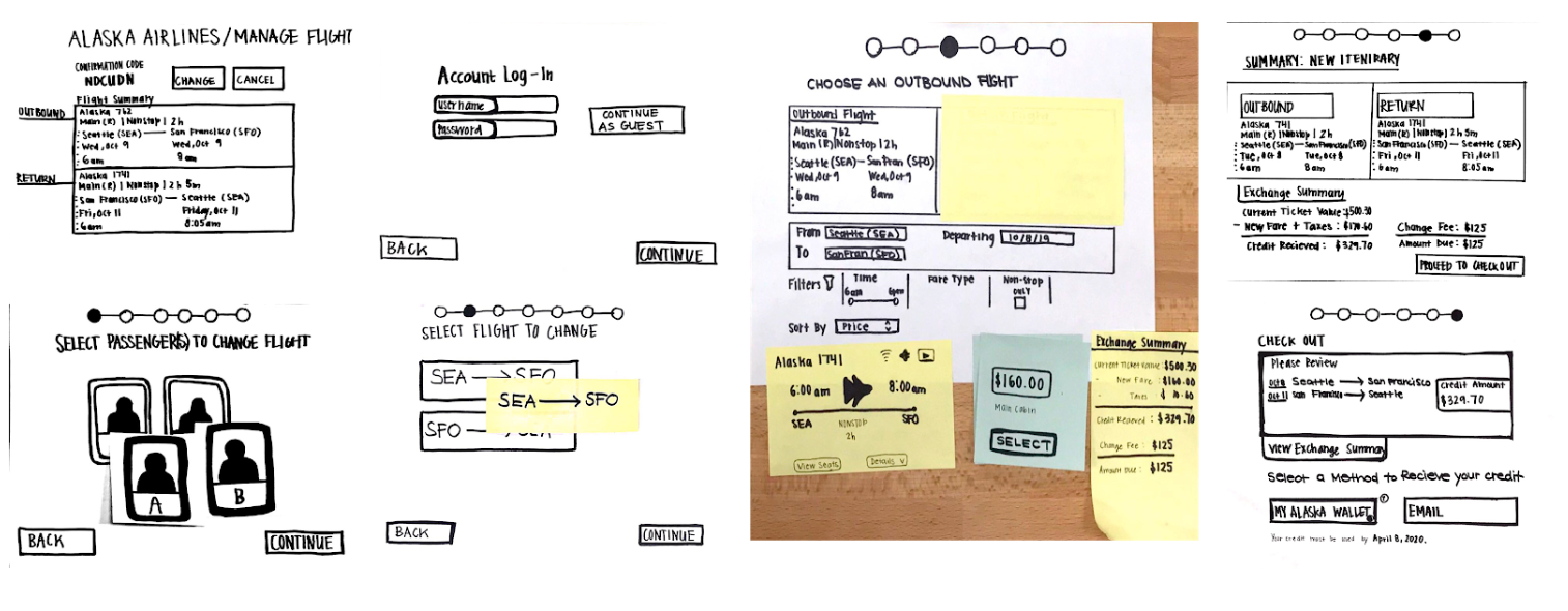
My team created two iterations of paper prototypes to test the initial ideas we had for our designs. We compared user flows, placement of messaging related to cost, and iconography, making sure our design was intuitive.
I helped create the first iteration of the our prototype, and in our tests, I ensured the design was balancing a simple interface with access to information to answer questions guest's may have as they move through the change process.
High Fidelity Designs
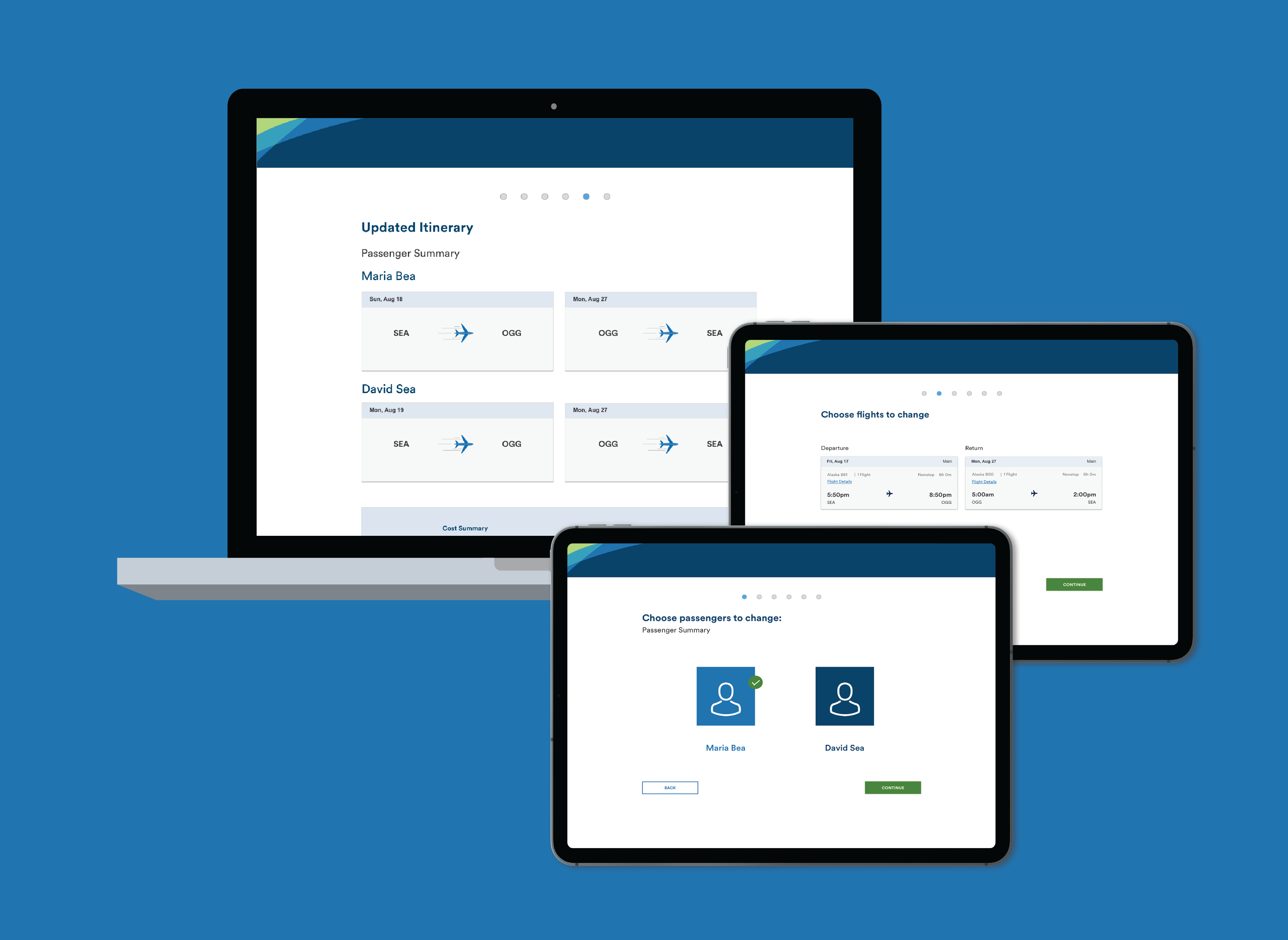
Using Sketch, my team designed our high fidelity design. I was responsible for the passenger and flight selection screens, and assisted with the cost summary design. After the design was finished, I linked the screens together using Invision. Eight users tested this prototype on UserTesting.com
I iterated on the design based on our findings, altering messaging surrounding change fee policies and removing problematic flight filtration options. Below are a few of the screens from our prototype, with features redacted for NDA purposes.
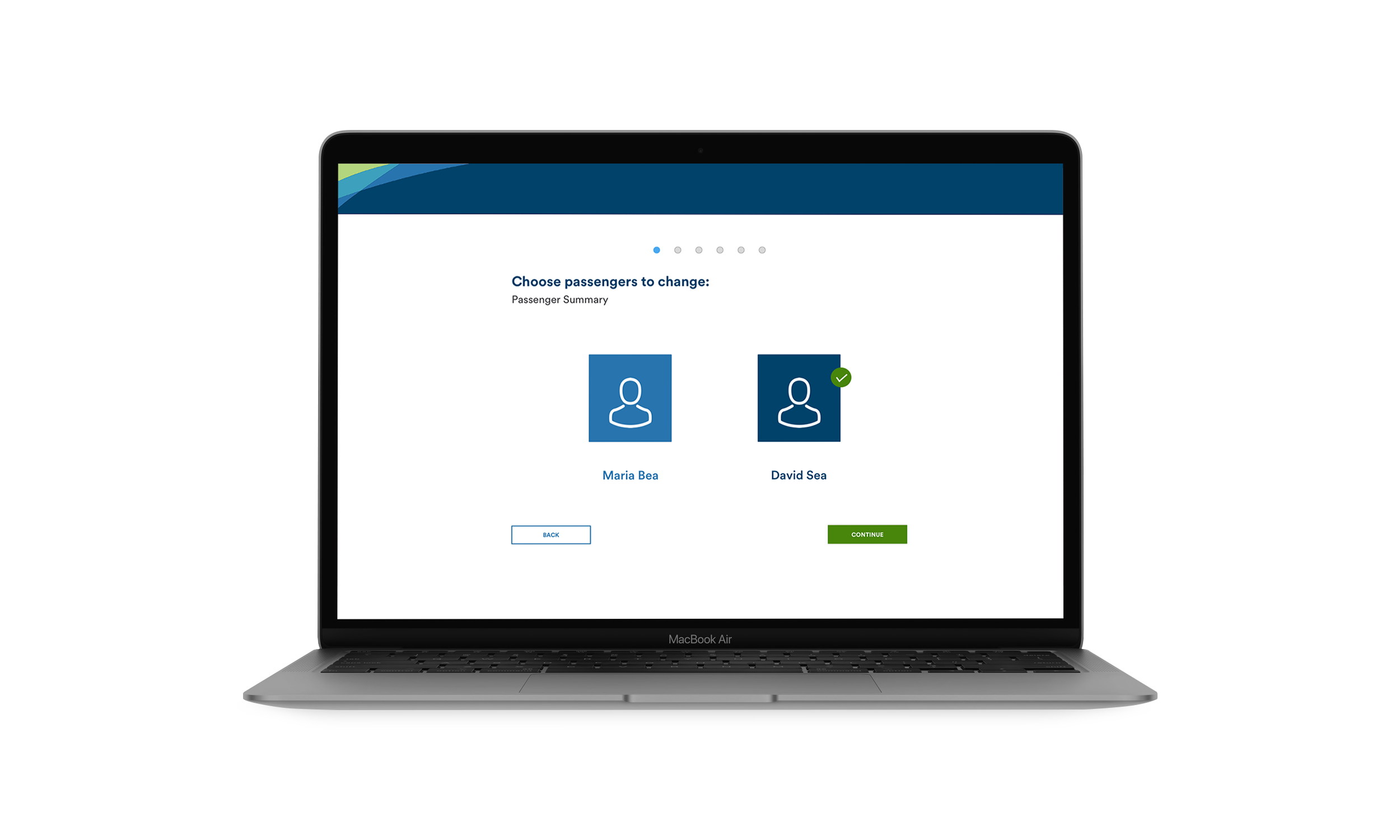
The Passenger Selection. In our system, we provide users with green checkmarks as a source of feedback to make them sure of their choices. The breadcrumbs to give users an idea of how many more steps they have in the process.
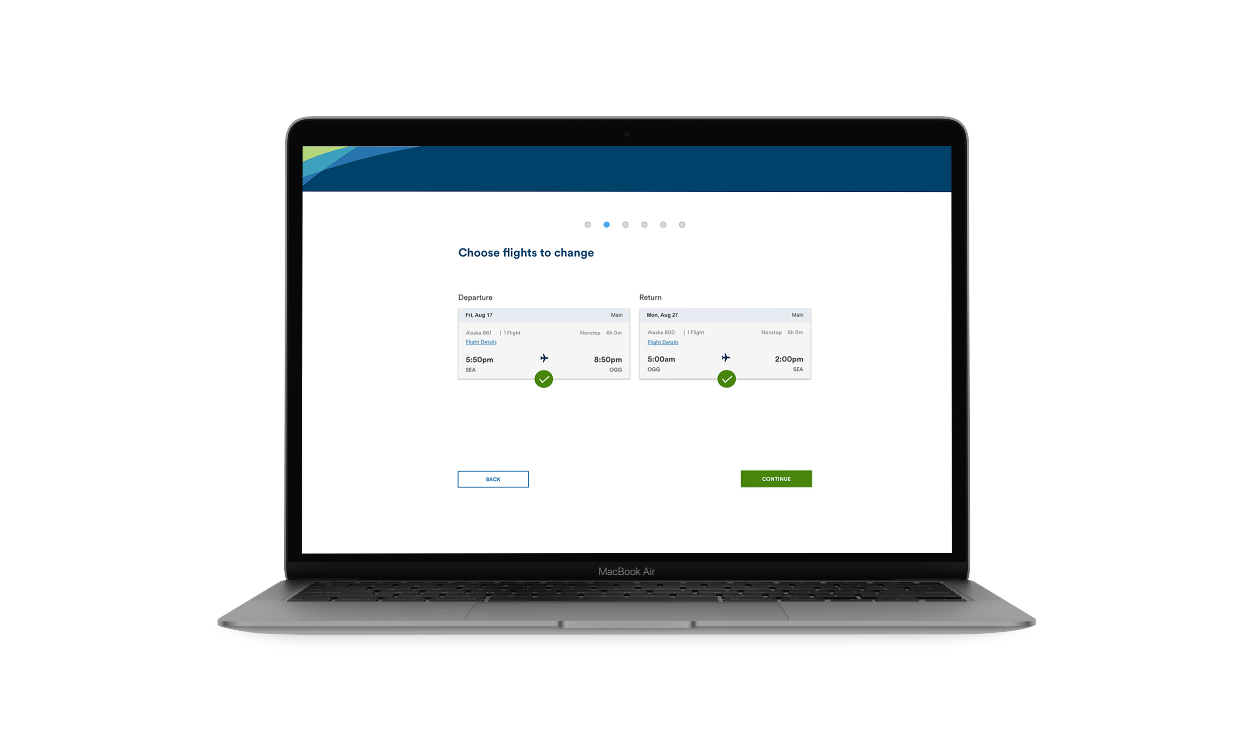
The Flight Selection. We isolated details the users needed, while still giving the information room to breathe. By breaking steps up into separate pages, we are reducing the cognitive load of the user.
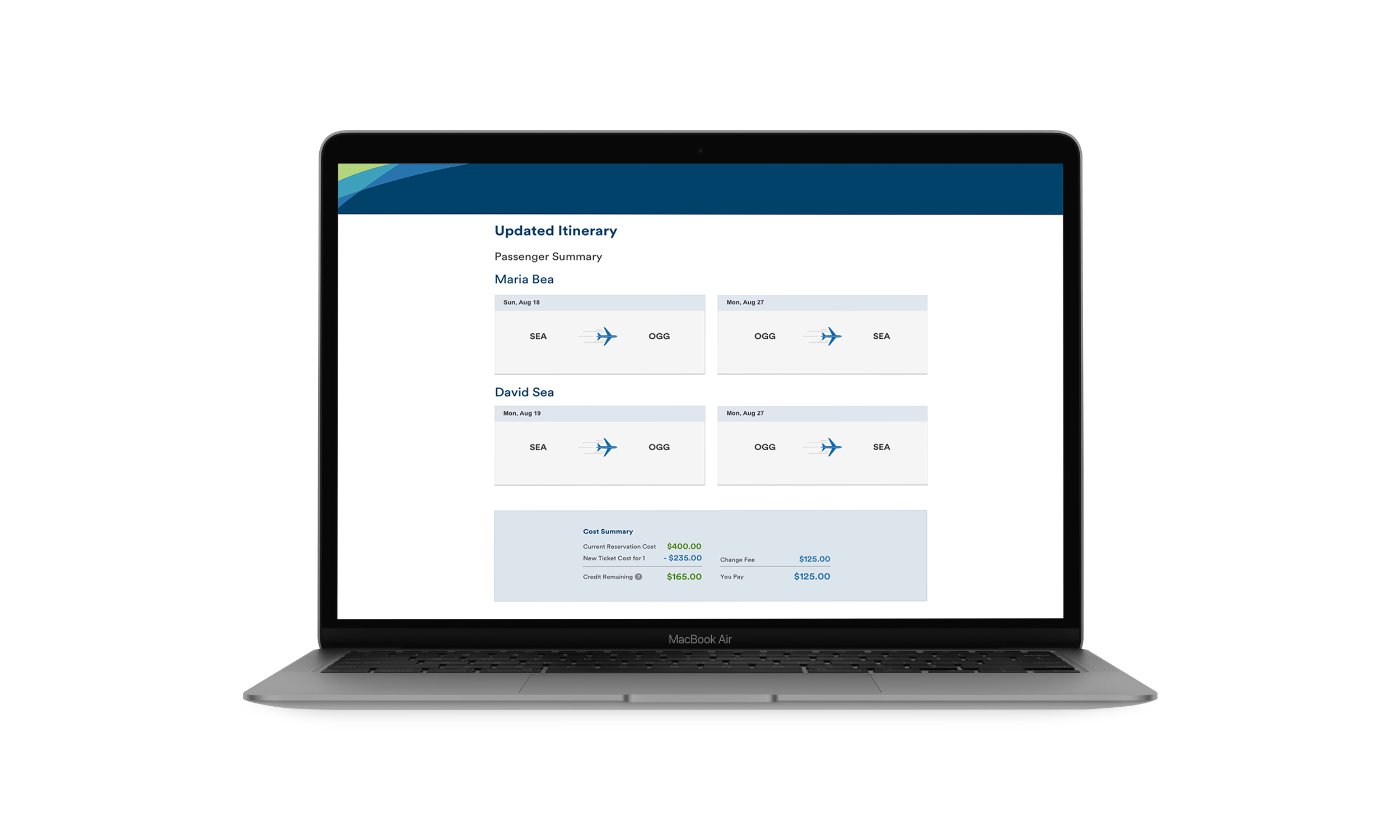
The Itinerary. The featured cost summary breaks down all of the components of the user's final total, including thee original flight cost, new flight cost, and any applicable fees, for complete transparency.
The Results
My team and I had the opportunity to present our final prototype to the Alaska Airlines product team responsible for the “change” feature. They were very excited about our redesign. Afterwards, we sent our design files along for testing purposes.
This was an awesome senior project for me. It was a great opportunity to take research and design end to end, and I was able to exercise all sorts of research and design muscles. I am very happy we got the chance to work with Alaska Airlines for this project. Because they are a company with such established user research and design departments, they were able to give us valuable feedback and always keep us on our toes.
All projects
VinFast Vehicle ProfilesUX Design + UX Research
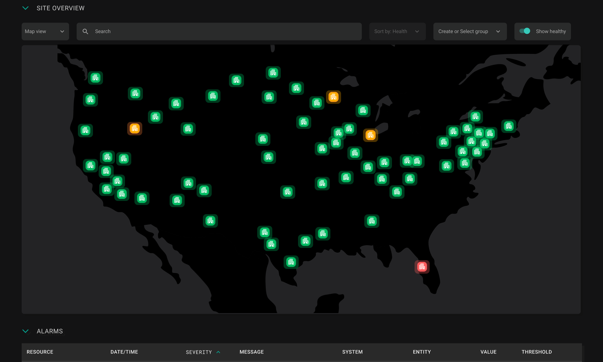
Wind River Studio OperatorUX/UI Design
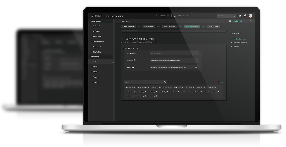
Wind River Studio DeveloperUX Design + UX Research

Wind River Virtual HardwareUX Design + UX Research
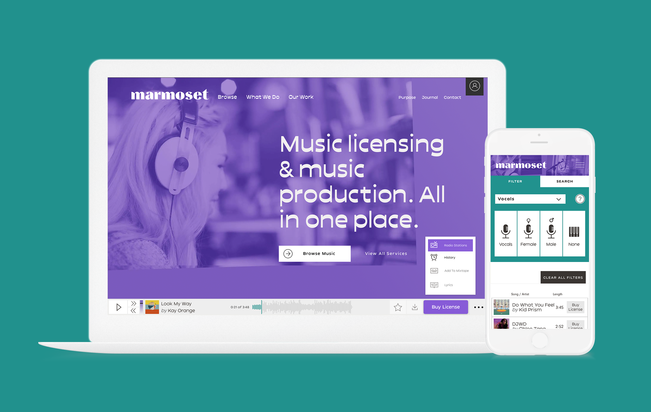
Marmoset MusicUX Research
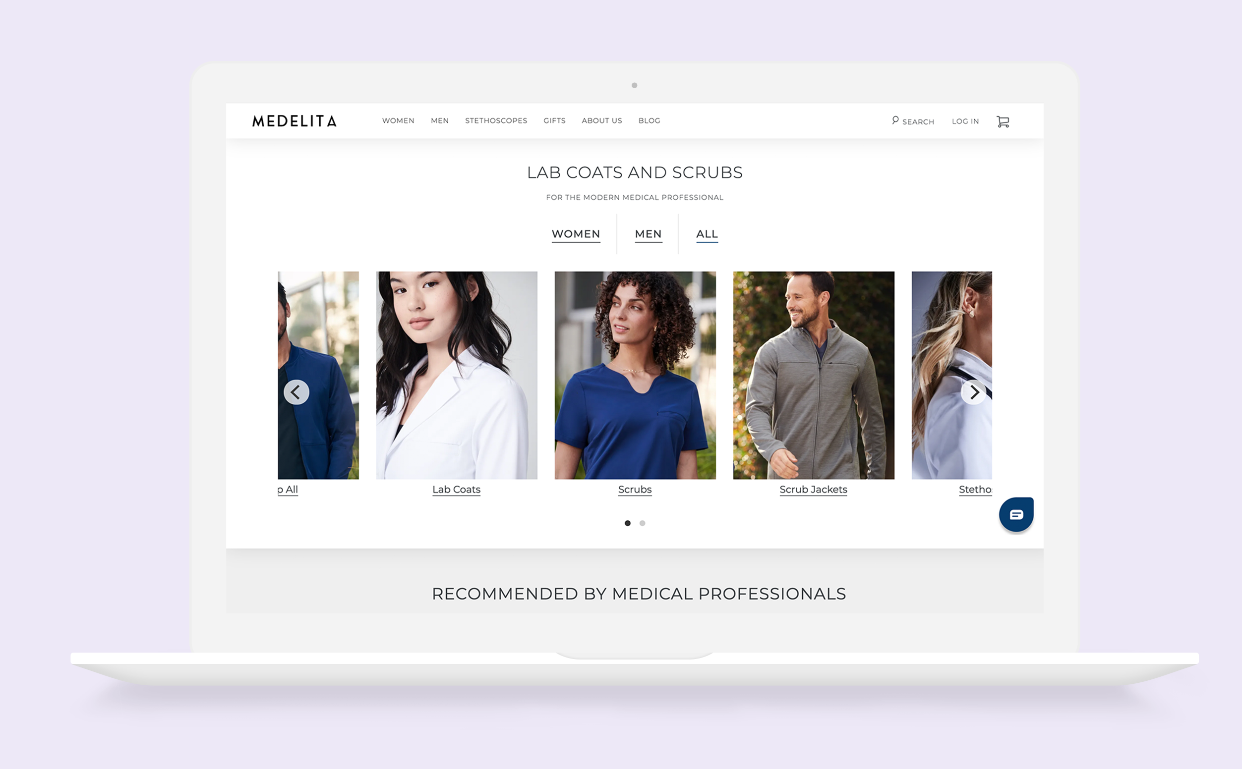
MedelitaUX Design

Alaska Airlines CapstoneUX Design + UX Research
Atari Women SuitE-textile Work
Digital Media @ ReBuilding CenterDigital Media Design
Carina Dempsey 2023